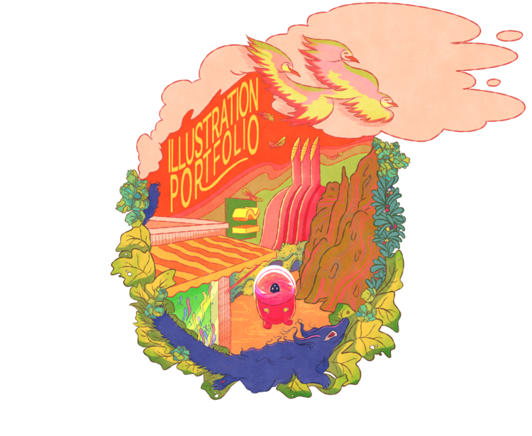
Zoe Almon Job


I’m an illustrator based in France. I’m drawn to work that’s gentle but a little strange, with room for atmosphere and feeling. I’ve worked on many projects from start to finish—often long-term—across board games, books, animation, and physical products, where the artwork needs to function as part of how something is played, read, or experienced. I work in both English and French.
Board game project #1
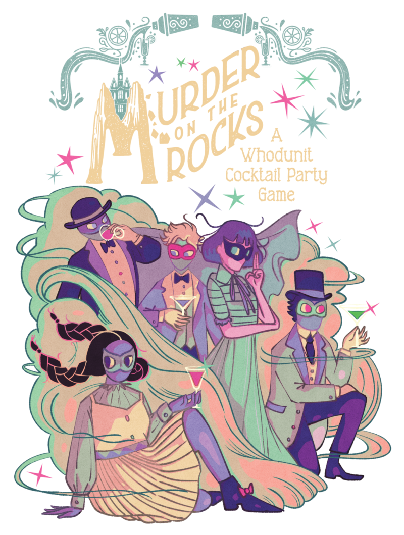
A party game designed and produced by Misfit Mixers. I illustrated 100 cards across the base game and two expansions, and handled packaging, extra assets, and the full Kickstarter campaign page.


Murder on the Rocks is a social deduction party game where the artwork is an active part of play. Players interpret visual clues to form theories, bluff, and uncover the truth, making the illustrations central to both gameplay and atmosphere.


Characters were designed with strong, readable attitudes to help players embody their roles, while also being symbolically layered. Many are associated with animal motifs—such as moths, swans, or bears—which reappear across the game as indirect references and visual hints. Patterns were used both decoratively and as a way to subtly hide clues.
The visual direction draws from Art Nouveau, noir, and mid-century illustration. Many of the illustrations are deliberately theatrical, reinforcing the idea that every character is performing a role—and may be hiding something.
The game is packaged inside a cocktail shaker, which naturally extended the project beyond cards. I designed additional assets such as bottle and vial labels, masks, tokens, and the rulebook, all tied together by the same visual language and tone.

I was also responsible for designing the Kickstarter campaign, which received a Projects We Love badge before launch and funded at over 10× its original goal. I contributed to the campaign video as well, focusing on mood and cinematic atmosphere rather than a traditional explainer.
Board game project #2
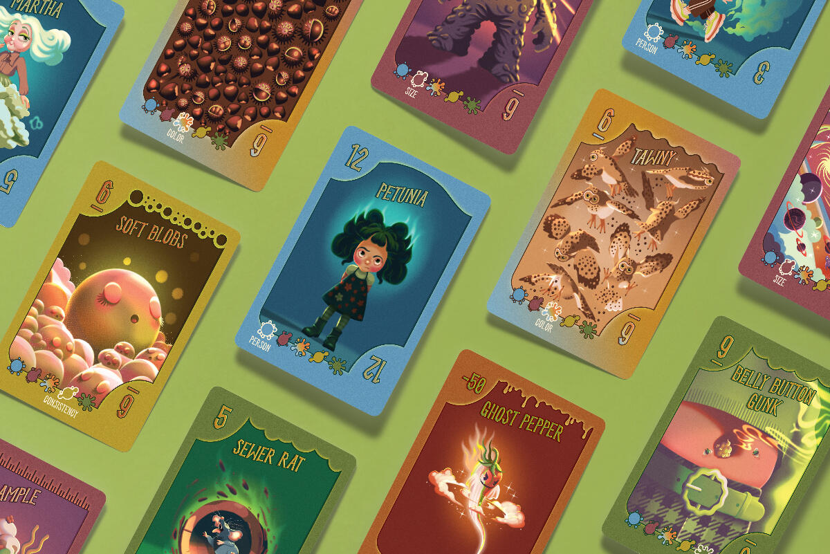
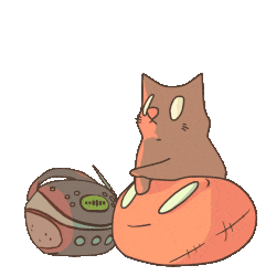
A children’s card game designed by Paper House Productions and Woodpecker Labs. I illustrated 97 cards across the base game and the Pet Expansion.


Go Poo is a silly, unapologetically gross card game for kids—where bathroom humor, smells, and questionable textures are very much the point. The challenge was to lean into the humor without tipping into anything genuinely off-putting, keeping the tone cute, mischievous, and age-appropriate.


The character designs are influenced by old-school cartoons, with bouncy shapes, expressive faces, and a slightly gothic edge. I often pushed hair or clothing into puffed, smoky, flowy shapes, so the “stinky” energy shows up everywhere and the characters feel right at home in it.


Many of the non-character cards deal with abstract — and frankly pretty ew — ideas like smell, texture, or consistency. I approached these by leaning on patterns, flowing shapes, and movement, turning things that are hard to draw (and harder to describe) into something funny, readable, and kid-friendly.
The game’s Kickstarter campaign funded at over 2.5× its original goal and received a Projects We Love badge in the final hours of the campaign.
Picture Book Highlight #1
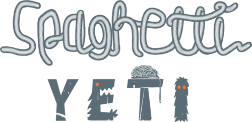
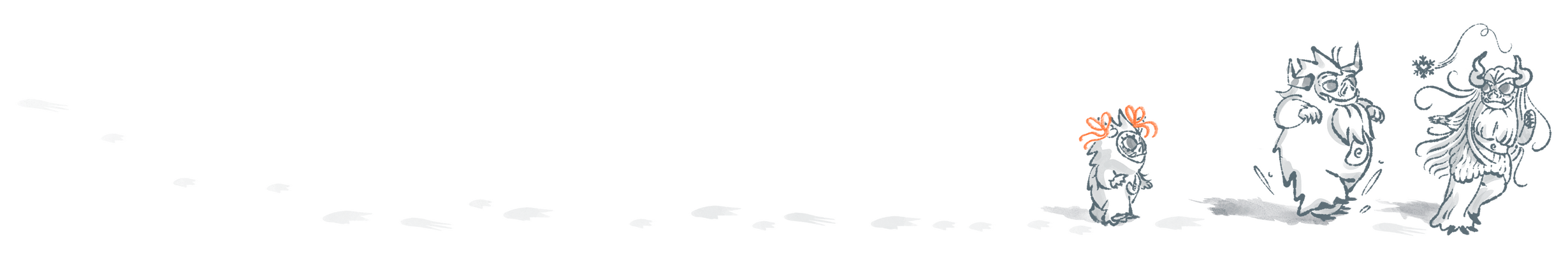
A 16-spread picture book written by Cree LC. I handled the illustration, cover design, and all text layout.
I approached the text design with the horizontal format in mind. Because the story centers on spaghetti, much of the lettering moves in long, flowing lines, echoing the shapes and direction of the spaghetti itself. In several scenes, the text follows the strands directly to connect the words with the action.

For the yetis, I designed silhouettes that feel weighted and grounded, creating a contrast with all the loose, drifting spaghetti shapes. They’re cute but not declawed—still monsters, still a bit wild.
Picture Book Highlight #2
An 18 spread picture book written by Sean Yale Knight. I created the illustrations, cover art, and text design.
The story takes place at night, so much of my focus was on capturing the atmosphere—moonlit silhouettes, shifting shadows, and the feeling of wind moving through the scenes. I used double spreads to create a sense of immersion, letting the flashlight beam, rustling leaves, and sudden movements guide the pacing.
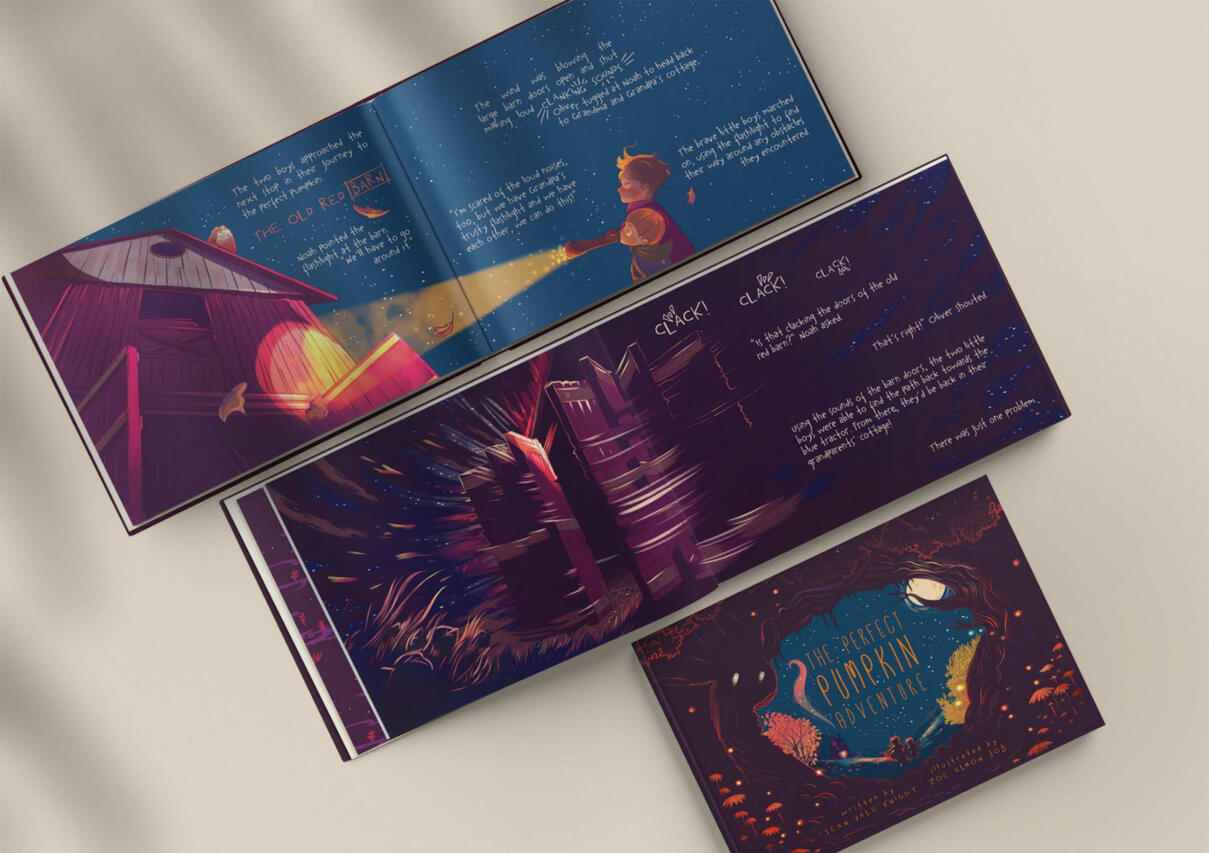
My goal was to stay close to a child’s-eye view: everyday objects appear large and mysterious, the wind becomes swirling lines, and motion is suggested through quick strokes and abstract shapes.
Applied illustration
A character-led illustration project spanning animation, social media, and physical products.
Less Than Three (LT3) began as an NFT art project and grew into a broader illustration world. I designed the visual identity to feel simple and quiet, yet dreamy, slightly melancholic, and emotionally relatable.
As animation became a central part of the project, I created a reusable animation workflow and clear visual guidelines using Blender. This system made it possible for other artists to produce animations that stay consistent with the original look, while I continue to handle the larger, more complex animation pieces and product-focused videos.
The artwork was later adapted into physical products including pillows, apparel, mugs, embroidered tote bags, and small accessories. Some of this content—especially the pillows—went viral on TikTok.

Across illustration and animation, my focus was on building a cohesive mood: warm, romantic, a little wistful, and easy to connect with. Much of the project’s popularity comes from how naturally the imagery is shared between people as a way to express feelings, rather than just to promote a product.


Today, LT3 reaches ~69.5K followers on TikTok and has accumulated 278M+ views on GIPHY, showing how a consistent visual mood can translate across platforms, animation, and physical products.